

Rebranding is not easy. Rebranding a well-established company that has become synonymous with a form of healthcare communication is even harder. Executing that rebrand in just 9 months while simultaneously preparing for healthcare’s biggest event – the annual HIMSS conference – is a near impossible task. Yet that’s what the team at TigerText, now TigerConnect, pulled off earlier this year.

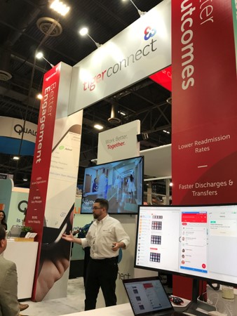
At HIMSS18, TigerText became TigerConnect. Along with the new name came a new logo – albeit one with a clear homage to their company’s past. The new logo features a cleaner font style and a clever graphic element. If you look closely you will see that the graphic is four interlocking C’s which represent the company’s goal – Connected, Clinical, Communications, and Collaboration. The four colors are meant to represent the four different members of the care team: Doctors, Nurses, Allied Health Professionals, and Patients.
![]()
“The old brand was really about texting and compliance,” explained Kelli Castellano, Chief Marketing Officer for TigerConnect. “Not only was the word ‘text’ front and center, but our old brand also had a text box with a lock symbol as the main graphic. You couldn’t get more literal than that. When we first started, we were focused on being the best secure texting and compliance solution in the market. We sold to healthcare compliance officers and to CIOs. The TigerText brand personified that focus and it really served us well.”
But then in 2016, the company launched a new clinical workflow solution called TigerFlow.
“When we showed TigerFlow to prospects it was well received,” Castellano continued. “But people would leave the meeting wondering why their texting company was talking to them about clinical workflow. Worse, many clinicians were confused on being invited to a meeting with TigerText – a company they viewed as a technology infrastructure provider.”
By early 2017, after a few months of research and introspection, the team realized that the company name and brand was holding them back. It was simply too much to ask their target audience, which now included clinical decision makers like CMOs, CMIOs and CNOs, to see the company as anything more than a texting platform.
Castellano and the rest of the Marketing Team knew that rebranding the company would be risky. After all, hundreds of thousands of users click the TigerText logo each day on their phones to communicate securely with their peers. “TigerTexting” had even become a verb used by their customers to describe the act of sending messages through their system.
To gain buy-in and build internal momentum for a rebrand, Castellano asked her team to “do the research” and gather feedback from stakeholders including: customers, board advisors, partners and staff. They found there was consensus for changing the TigerText name.
After three months of work, Castellano and her team, with the support of Co-Founder and CEO, Brad Brooks, officially began the rebranding initiative.
It was now the end of spring 2017 and Castellano set an ambitious goal of launching the new brand at HIMSS18 – only 9 months away. “It was definitely an audacious goal,” admitted Castellano. “But we all knew that it just had to get done. Our Sales Team needed it. Our company needed it. We just had to move forward.”
 Castellano allocated half of her ten person team to work on the rebrand while the other half worked on HIMSS18 pre-show marketing and building up their sales funnel. Everything came together and on March 6th the new brand was revealed.
CEO Brooks explained the new name this way: “Our new name – TigerConnect – allows us to clearly articulate the true value our solutions deliver. We connect care teams, existing data systems, and ultimately healthcare communities across a centralized and highly scalable clinical messaging platform. It is this real-time connection to data and people that dramatically improves the way healthcare organizations communicate to drive better results. We wanted that value to be reflected in our name and brand icon which are 4 interlocking C’s that represent Connected Clinical Communication and Collaboration.”
According to Castellano the reaction internally has been overwhelmingly positive. “We gave our staff a preview of the new brand in January. Everyone was very proud and happy with the new name. It was fresh and new, yet it still had a nod to our heritage and roots. Everyone felt that the new brand would allow us to better position the company and elevate the conversations we were having.”
“The reaction at HIMSS was also very positive,” noted Brooks. “The name change gave us the opportunity to talk about our story. We talked about where we had been and where we were going. It was really a lightbulb moment for visitors to the booth. We got a lot of ‘Aha…that makes sense’ comments.”
Having led three rebranding initiatives at three different companies, I applaud Castellano and her team for achieving their goal in such a short time frame. To do it on top of preparing for HIMSS is simply incredible.
It will be interesting to track the growth of TigerConnect in the years to come to see if the rebrand helps the company reach its desired financial results.